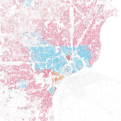
What you’re looking at is a bunch of little dots which together form a pretty accurate outline of the city of Detroit. You can see Woodward going straight out NW, the railroad going due north. But this isn’t because of lines drawn on a map. The colored dots represent race.
There is a clear blue/red division on 8 Mile which separates blacks in Detroit proper from whites in Oakland County just a few steps north. Each dot represents 25 people of a given race. The orange area in southwest Detroit is Mexicantown. Hamtramck is shown as a melting pot, whereas Highland Park, the other nearby enclave is completely undiscernable.
This can’t be healthy for a region, can it? On the other hand, the city of Chicago has fairly extreme divisions by neighborhood and street as well as between city and certain neighboring suburbs.
And the original Detroit race map is on flickr.


